Most people know me first and foremost as an interior designer. But I’m also a colour specialist. Colour psychology is such an interesting area, because colour per se can influence almost everything we think, feel and do. Most people are aware, on some level, that colour psychology is used widely in branding and marketing. But it is such a powerful interior design tool too, and one that is capable of completely transforming the mood and even the function of a room.
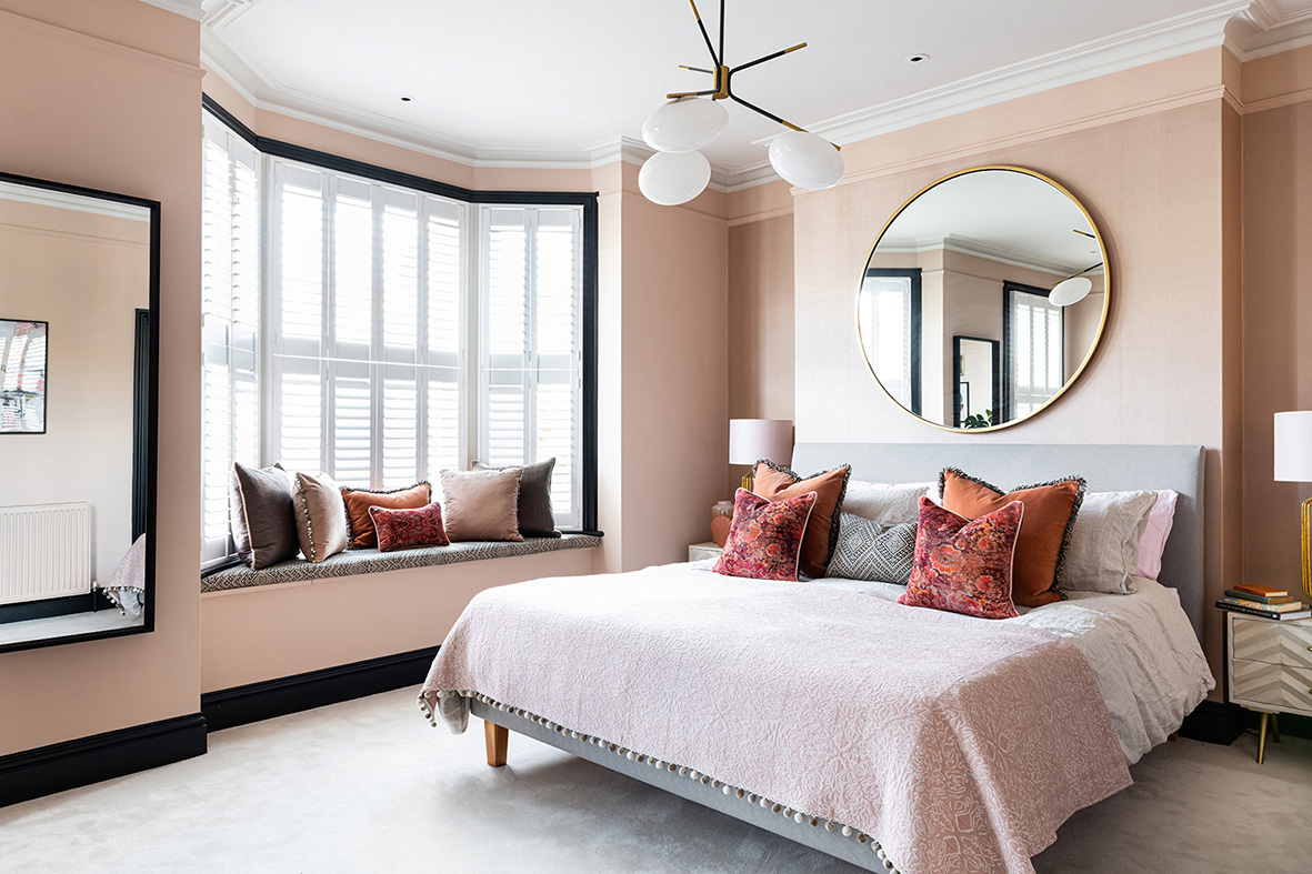
Blush pink, chosen to create a gentle yet elegant look, is the key colour for this Wandsworth master suite bedroom. It contrasts well with the black Victorian window frames
Why is understanding colour so important?
Many clients are reluctant to use too much colour in their homes, and I understand they may be wary. However, this should be – and is in my schemes – central to the design, and not a mere afterthought at the end of the design process. Colour creates the emotive connection between clients who own a home, and the home itself. In essence, colour, and colour psychology, can be used to create a space or home that feels good to be in. I believe a good designer can become a great designer by understanding both colour and its many subtleties. But I don’t ask my clients which shades they want. Instead, I ask them how they want a room to make them feel.
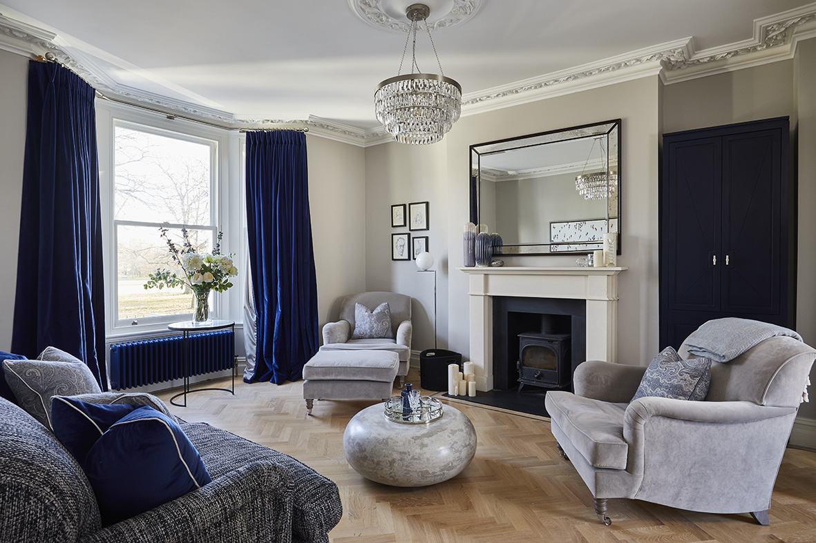 Deep blue hues, such as navy, have royal associations and conjure confidence and trust, while paler hues evoke calm and serenity. I used opulent blue velvet cushions for this glamorous living room – and created a deep blue bespoke built-in bar to match!
What exactly is colour psychology?
Colour creates a feeling or mood, and influences our behaviour. Clients often have a particular attraction to a certain colour, and this generally relates either to the personal associations that come with it, conventional cultural meanings, or its meaning psychologically. Colour psychology is almost a subconscious influence on how we feel and behave. It affects our wellbeing in not only a mental and emotional sense, but also physically.
To discover why a client might associate a certain colour with a particular feeling can be revelatory. And it’s important to realise how significant even different tones can be. For example, I love green but, on a personal level, not the shade racing green because that was the colour of my school tie! As a designer, to recognise all this, and be able to use this knowledge wisely, is wonderful. It’s vital to realise that colour and its usage is not always straightforward. But when I do create a successful colour scheme, it has a very powerful effect and sense of harmony.
 Green has obvious links to nature, and often features in biophilic room schemes that strive to bring the outside in. It’s also perfect for creating a natural feel and relaxing ambience
Selecting the right colour palette
Understanding colour psychology can help us to use colour to create (and change!) a mood, an experience or an emotion. We make choices daily, from the clothes we put on in the morning to what we buy at the shops. These are all subconsciously based on colour. Just like different shades, tones are also important. So, it’s vital that I choose the right tone – and not just the right colour – to complement my client’s personality. For example, grey can have warm pink tones, yellow tones or cool blue undertones. Understanding colour psychology also helps me to place particular colours with others within a scheme of various tone and proportions.
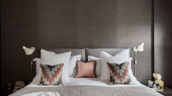
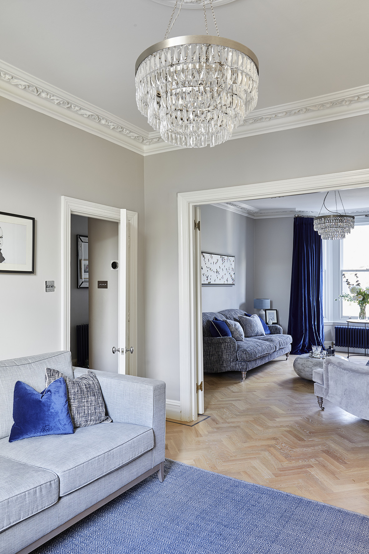 Often criticised nowadays for overuse, grey is an extremely adaptable colour, which can be used to evoke feelings of calm, safety and intelligence. Sometimes I’ll use it as a neutral backdrop, in either lighter or darker shades
Current trends and colour choices
Are current trends very important when it comes to colour choices? That depends. Colour trends can be affected by a great many things, from fashion to stress. Post-COVID, there has been a resurgence in warm neutrals. Colour psychology suggests that this is because we want our homes to be safe, cocooning sanctuaries. Green has also become popular. This could well be connected to how so many of us were deprived of outdoor spaces and being with nature during the different lockdowns.
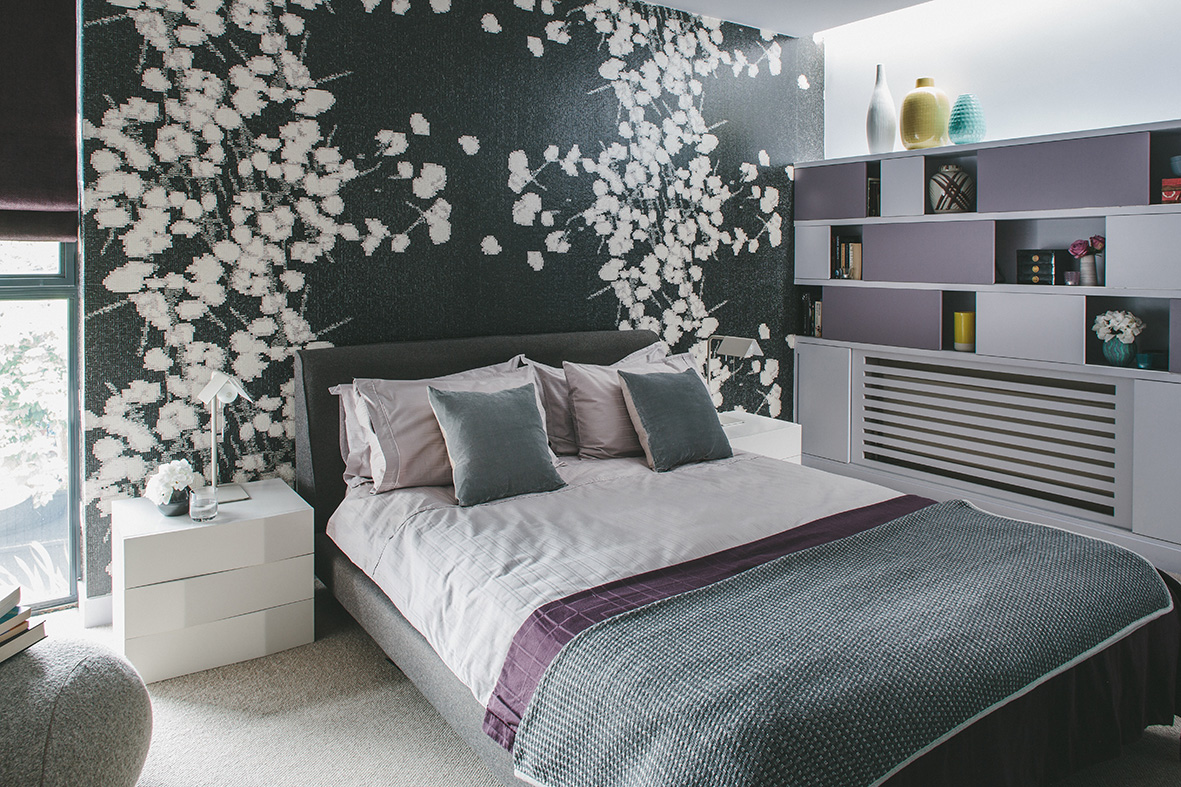 Will purple enjoy a serious resurgence now that Pantone has declared Very Peri to be its Color of the Year 2022? This colour is associated with many different things, including luxury, royalty and religion. I’ve used purple hues on the bedspread, blind and shelf detailing for a statement shade in this bedroom
Transforming homes using colour psychology
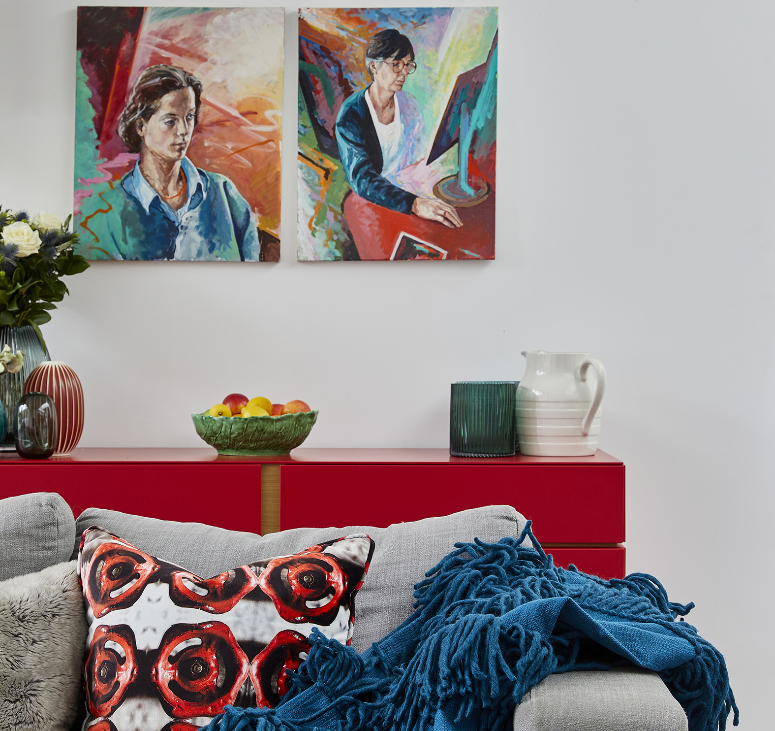
I use my knowledge of colour to transform homes in a variety of different ways. The ability for colour to create an experience, or generated a much-wanted emotion, makes it one of the most valuable tools I possess. There’s a certain way of working with colour, mixing tones, patterns and textures. I also often introduce a “disruptor” colour, something that might seem out of kilter initially, but is unexpectedly fantastic and pulls everything together.
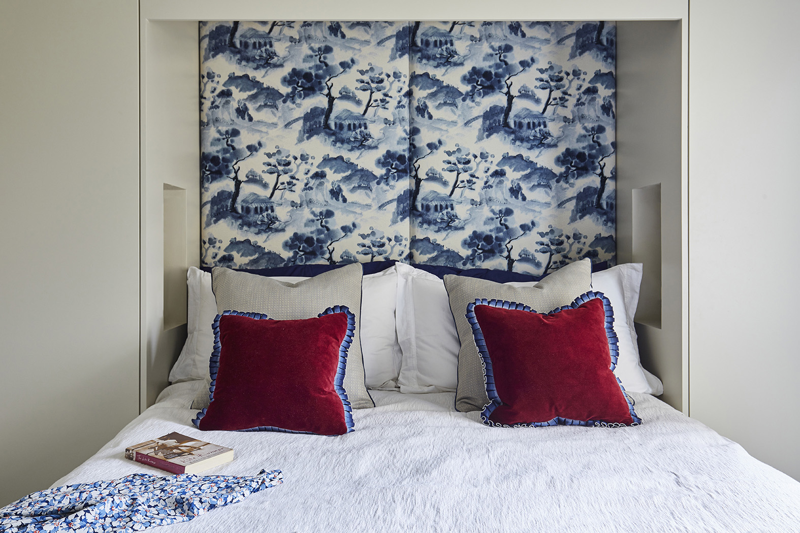
Red is one of the most emotional colours – and often a difficult one to use successfully – but it’s a great way to brighten up a room scheme. Here I’ve used a darker burgundy shade as a “disruptor” colour in this blue and cream bedroom featuring an Oriental-style headboard
Colour coherence and consistency
I often like to work a colour thread into whole house schemes, so that the rooms flow and nothing from one room would be out of place in another. It’s all about creating a cohesive, yet subtly different, look. The starting point is often a feeling, emotion, reaction or tone. I listen carefully to my clients to understand how they want to use a room and how they want to feel (the colour psychology part). Then I start to think about how different colours work together, and how to interpret that into specific tones and shades. Being a professional colour specialist enables me to create schemes that will positively impact my clients’ moods and behaviours for a long time to come. What could be a better investment?!
You can find out more about my latest news and projects if you follow me on Instagram, Linkedin and Pinterest.


